Path Analysis
Visualization of user journeys for product teams to understand how users truly interact with their product/site.

ARR increase of 20% from previous quarter.
Adopted by 78% of accounts.
Expansion rate of 15% on overall contract value.
Increased retention rate to 92%.
About
Auryc is a product analytics platform that helps product teams understand user experiences, product performance, and prioritize improvements. It offers session replay, analytics, and voice of customer feedback.
Role
- Lead product designer
Timeline
- Q3-Q4 2021
Contribution
- Research
- Scoping & prioritization
- Design
- QA
Team
- 1 Product manager
- 2 Developers
- 1 Backend engineer
Background
As Auryc scaled, path analysis became a highly sought-after feature from our customers and leads.
Not having path analysis created a feature gap and a loss of customers.
Auryc’s Looker integration provided a broken user experience.
Opportunity
How can we provide a more intuitive & differentiated path analysis experience?
More Control
Building a native tool gives us control over tool behavior and look allowing us to improve UX through flow optimization and design consistency.
More Value
Integrating session replay, behavioral analytics, and feedback data will provide users a more complete understanding of the customer's digital journey.
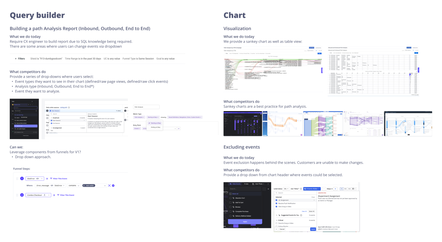
What are we working with?
I conducted an audit of our current path analysis tool to gain a better understanding of how it works and how we can improve the user experience.
Components
- Query Builder
- Chart
- Chart Interactions
Types of Analysis
- Inbound
- Outbound
- End-to-End
Key Findings
- Creating and editing charts required technical expertise or support.
- Chart results are overwhelming and difficult to understand.
- Didn’t surface Auryc’s strengths.
Goals
Right away, we could see some clear goals to set for each component.
Easy
It should be easy for users to create the three types of path analysis charts we offer via Looker.
Aside from developers, most Auryc users don’t have a technical background.
Insightful
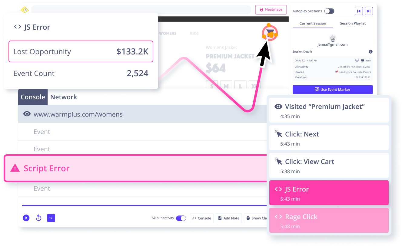
Tooltips can lead to more path context than only the traffic count.
We are already collecting data such as drop-off, conversion value and session recordings; How can we introduce this and bring more value to our users?
Clear
Event names and paths should always be legible, distinguishable at a glance, and hint at their interactivity.
The difference in traffic amount between paths should also be identifiable at a glance.
Shadowing Sales & Support
Sales and support teams constantly engage with customers and leads experiencing problems. I decided to join a few sales and support calls in order to collect customer pain points with path analysis and validate my audit findings.
The overwhelming visualization of user paths made it hard to find valuable insights.
“I’d like to see the path analysis feature be easier to use , less cluttered. It would be nice to filter the results by page, user segment, or date range.”
Session replay access from paths would help users identify and fix bugs and usability issues more effectively.
“ ...it would have been even more helpful if I could see a replay of that flow. That would have saved us a lot of time trying to figure out what happened.”
Customers wanted to easily identify frustration within user paths.
“Rage clicks have been a huge help in identifying areas of our UI that are causing frustration. If you could incorporate rage clicks into path analysis, that would be amazing.”
Looker reports were difficult to use and required customer support assistance.
“There are a number of configuration areas where things I’d want to be self-service require a request to the Auryc team.”
Competitive Analysis
After participating in a couple calls I took my learnings and conducted an analysis of our top competitors. The goal here was to explore path analysis best practices and identify any feature gaps we could capitalize on.
Areas of Opportunity
Through competitive analysis, I was able to identify several opportunities where integrating Auryc’s capabilities could help create an enhanced path analysis experience.
Opportunities
- Limited data in tooltips.
- Session replays separate from chart.
- Few supported raw click events and event definition.
- Few competitors surfaced frustration.
Best Practices
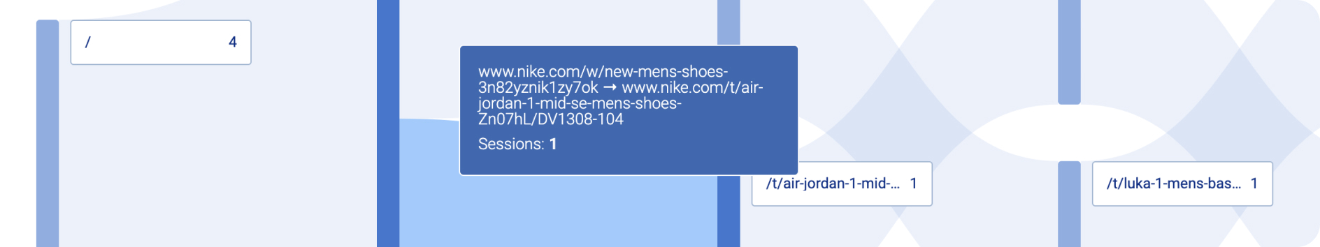
- Sankey diagrams are the most effective way to display user paths.
- Charts need to give users control over noisy data.
Research Conclusion
After gaining a better understanding of path analysis in the market, I met with my product manager to synthesize my findings and establish a direction for our MVP. We then broke path analysis down into two phases.
Laying the Foundation (Phase 1)
Read-only inbound, outbound, and end-to-end charts.
- Allow users to handle noisy data.
- Only supports defined events.
Intergrating Strenghts (Phase 2)
Path Analysis with Auryc’s existing features.
- Tool-tips with supporting metrics.
- Session replay
- Event definition
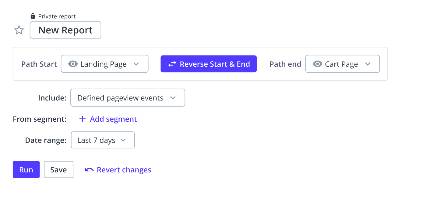
Query Builder
The first component I started working on was the query builder. 2 different versions were tested internally before we reached the final design.
V1
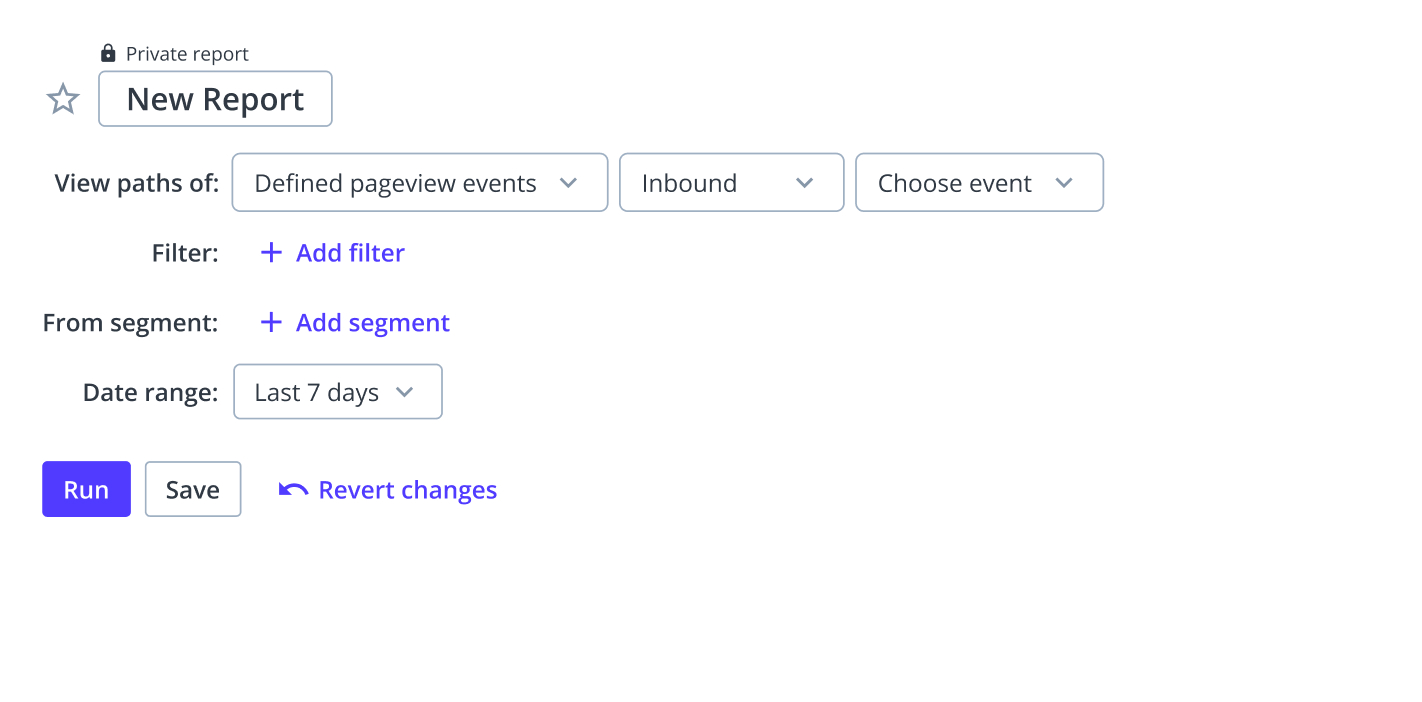
Pros
Easiest to implement because it followed current method of building queries.
Cons
Query was not easy to read and understand.
V2
Pros
Avoided technical terms making copy accessible and allowed for quick switch in analysis direction.
Cons
During testing users often missed the “Include” option due to its placement.
Final Query Builder
I went back to the drawing board and applied the feedback I had received. In this last version I introduced an option to select the number of steps in order to collect the teams thoughts and effort estimate . The team saw the value in the flexibility it would provide and considered it low effort.
Pros
Exposed analysis options improved discoverability and made it easy for users to switch between analysis types.
Grouping all options specific to path analysis into a single section ensured users didn’t miss any options before moving onto the next set of parameters.
Cons
Analysis terms could cause confusion to users that were not familiar with them. After launch we decided to include a small info icon that provided users with definitions and analysis examples.
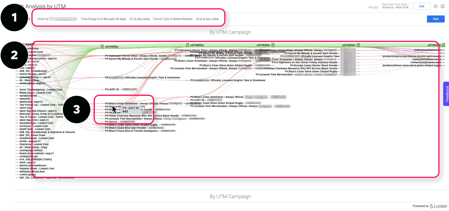
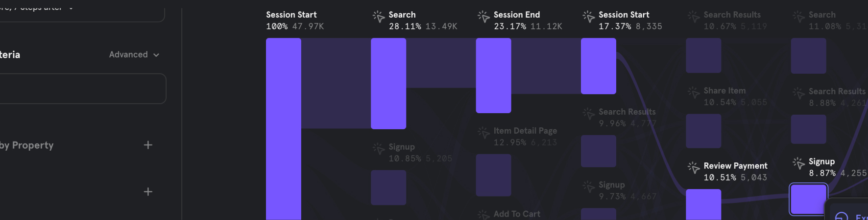
Sankey Chart Design
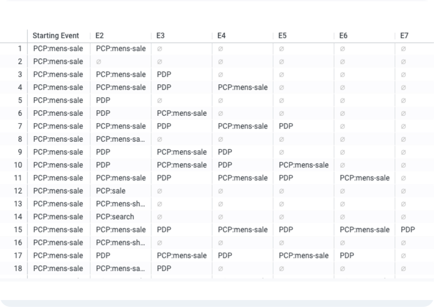
Creating the sankey chart was the most difficult part of this project due to its complexity. In order to start grasping the concept I started with an exercise of translating the table view of an outbound path analysis into a chart.
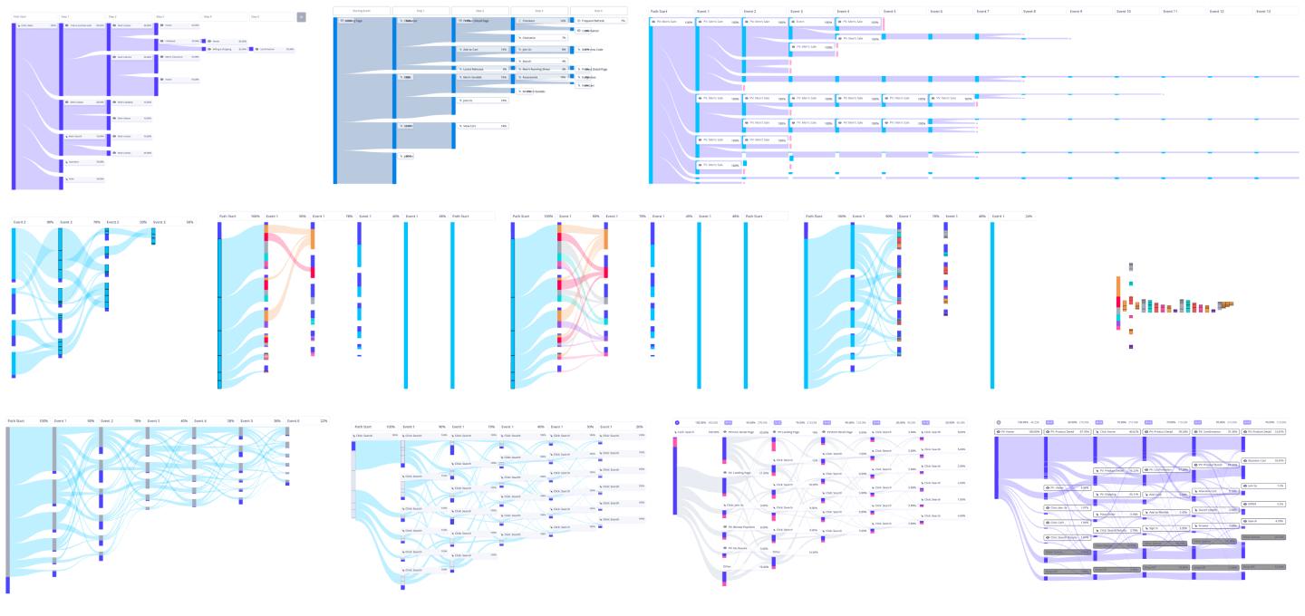
More Chart Exercises
Using developer tools I inspected several sankey charts looking for patterns and relationships between paths and events. After several exercises I was able to create a sankey chart that clearly visualized the flow of traffic from one end to another.
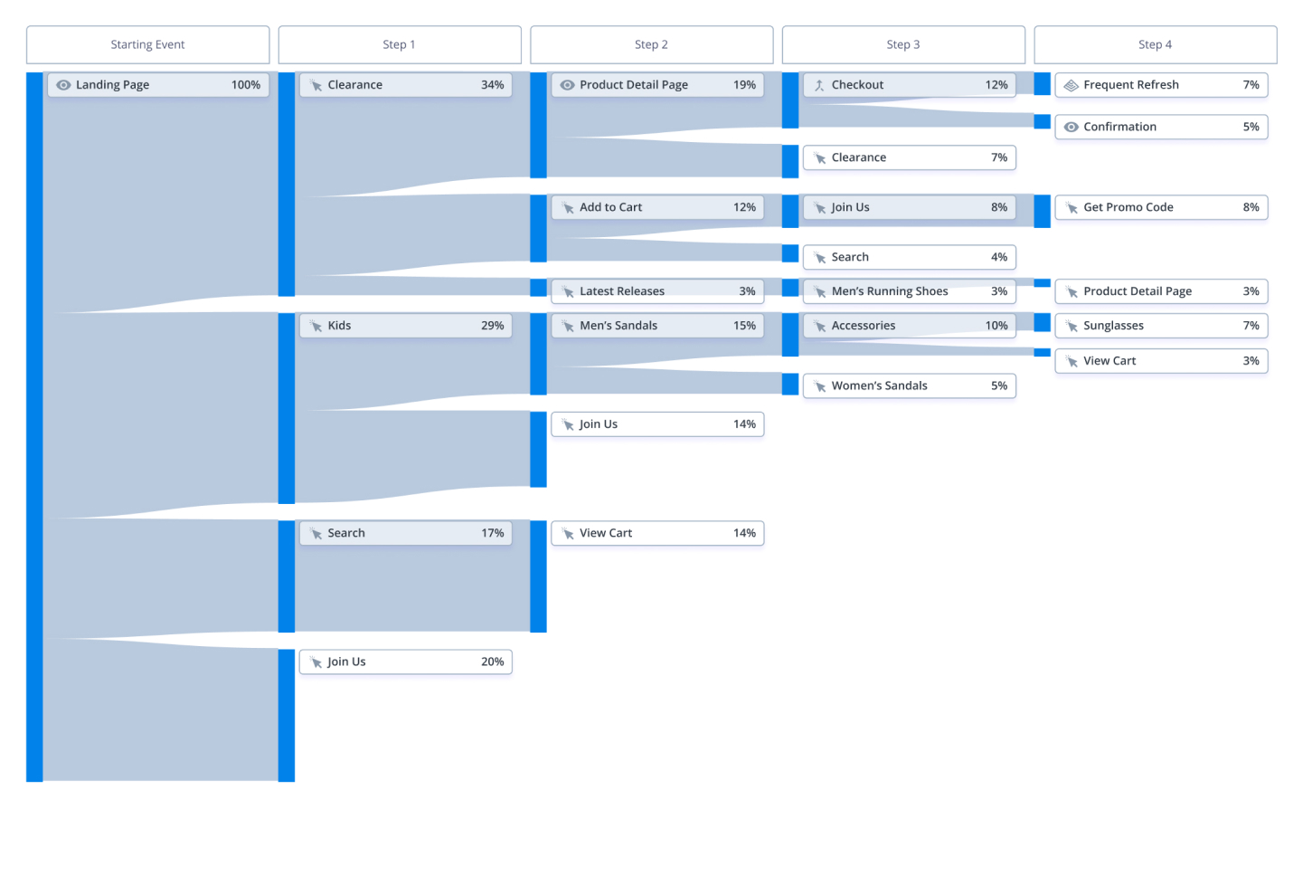
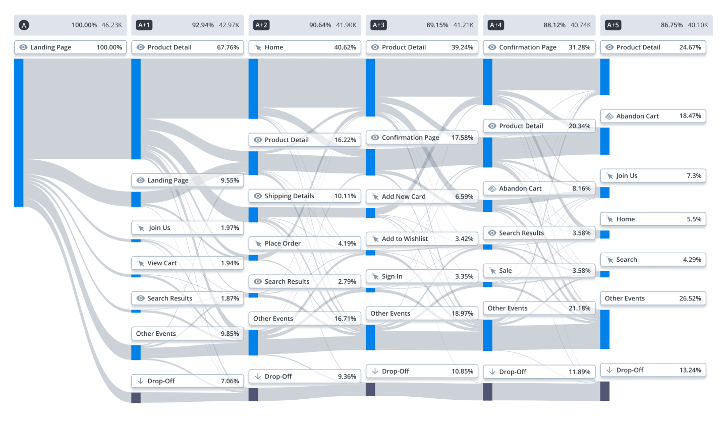
Final Sankey Chart
After several team reviews and rounds of feedback I was able to deliver a final version of the chart.
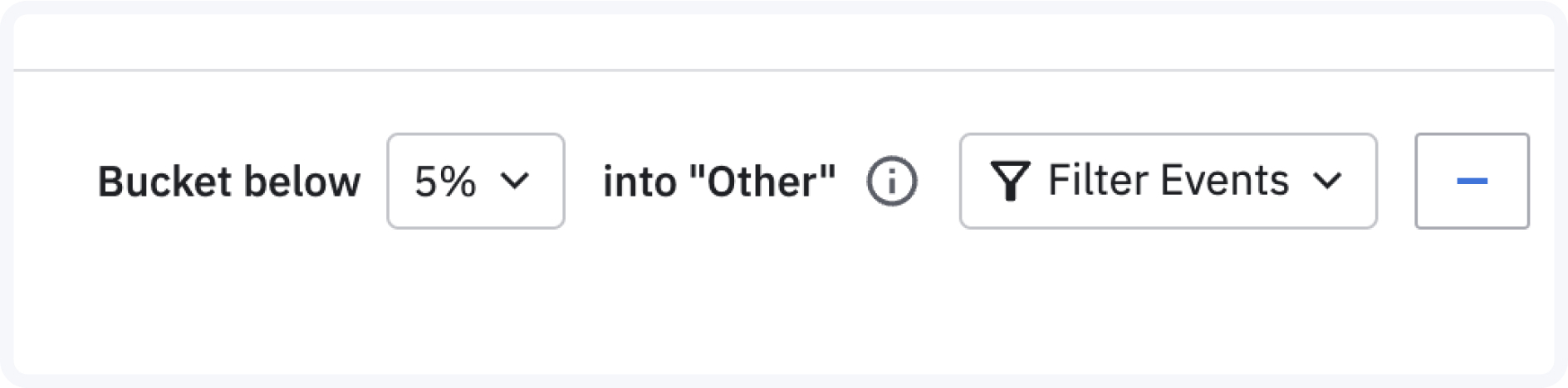
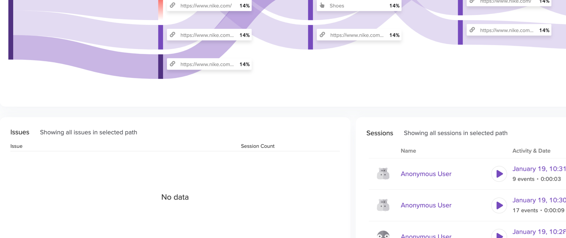
Excluding Events
I proposed 2 methods to exclude events from the chart: using the control bar or excluding from the chart itself. Due to the time crunch excluding events from the chart was pushed to phase 2.
Method 1
Excluding from Toolbar
The main way to exclude events would be via the control bar where it would remain visible for users who already have in mind the events they want to exclude.
Method 2
Excluding from Chart
The ability to exclude events from the chart itself is meant to reduce user effort by allowing them to exclude events on the spot without interrupting their analysis.
Laying the Foundation
Phase 1
- Inbound (Read only)
- Outbound(Read only)
- End-to-End (Read only)
- Event Exclusion
- Collapsed repeated paths/events
- Only supports defined events
Integrating Strengths
Phase 2
- Tooltips with supporting metrics
- Frustration events
- Surfacing of site and JS errors
- Path insights access
- Session replay
- Event definition access
In Production
Results
ARR increase of 20% from previous quarter.
Adopted by 78% of accounts.
Expansion rate of 15% on overall contract value.
Increased retention rate to 92%.