Auryc Dashboards
Empowering teams with the flexibility to tailor their data analysis to their specific workflows and decision-making processes.

About
Auryc is a product analytics platform that helps product teams understand user experiences, product performance, and prioritize improvements. It offers session replay, analytics, and voice of customer feedback.
Role
- Lead product designer
Timeline
- Q1-Q2 2021
Contribution
- Research
- Scoping & prioritization
- Design
- QA
Team
- 1 Product manager
- 2 Developers
- 1 Backend engineer
The Problem
Auryc's out of the box dashboards, while insightful and convenient for jumpstarting data analysis, suffered from a rough UX and limitations.

- Dashboards were difficult to edit, users depended on customer support for any changes.
- Analysis reports created in other areas of Auryc were not supported, these reports had to be viewed individually.
- Complex charts and tables made it difficult to digest the important trends and patterns.
- Dashboard UI was not customizable and was not consistent with the rest of the platform creating a patched user experience in the platform.
First Steps
With the current customer pain points in mind I decided to take on the challenge and began working on a prototype to establish the vision of what Auryc dashboards could look like and the value they could provide to our customers and business.
Phase 1
We knew we didn’t have to reinvent the wheel when it came to dashboards. Through research and competitive analysis we gathered the minimum requirements that would allow us to ship an MVP.
Laying the Foundation
In order to reduce implementation and receive feedback before moving forward, Phase 1 would only allow customers to build personalized dashboards based on top reports from out of the box dashboards:
- Revenue
- Performance
- Optimization
- Customer feedback
Phase 2
Introducing Custom Reports
Phase 2 of dashboards would support all types of reports created within the platform.
Nice to Have
- Dashboard alerts based on threshold - email/slack
- Scheduled dashboards - email/slack
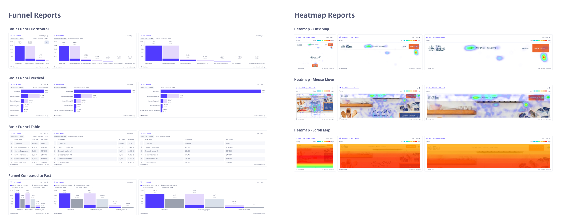
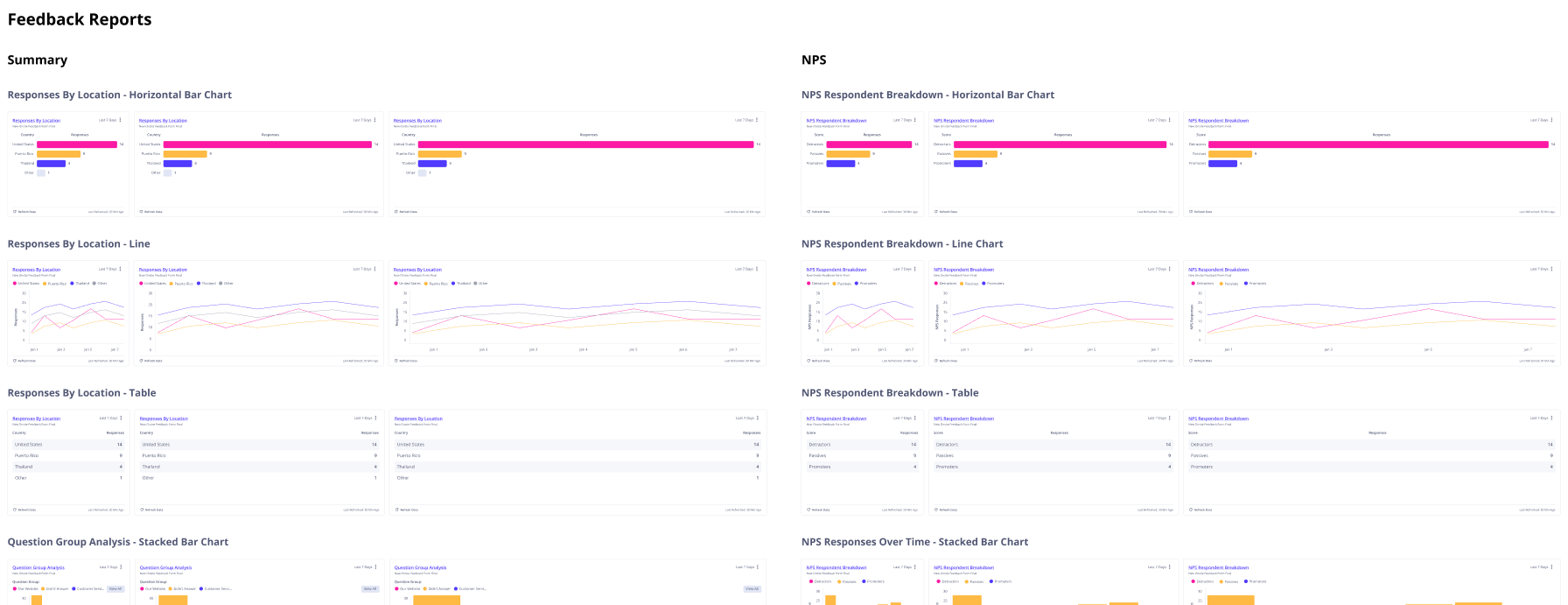
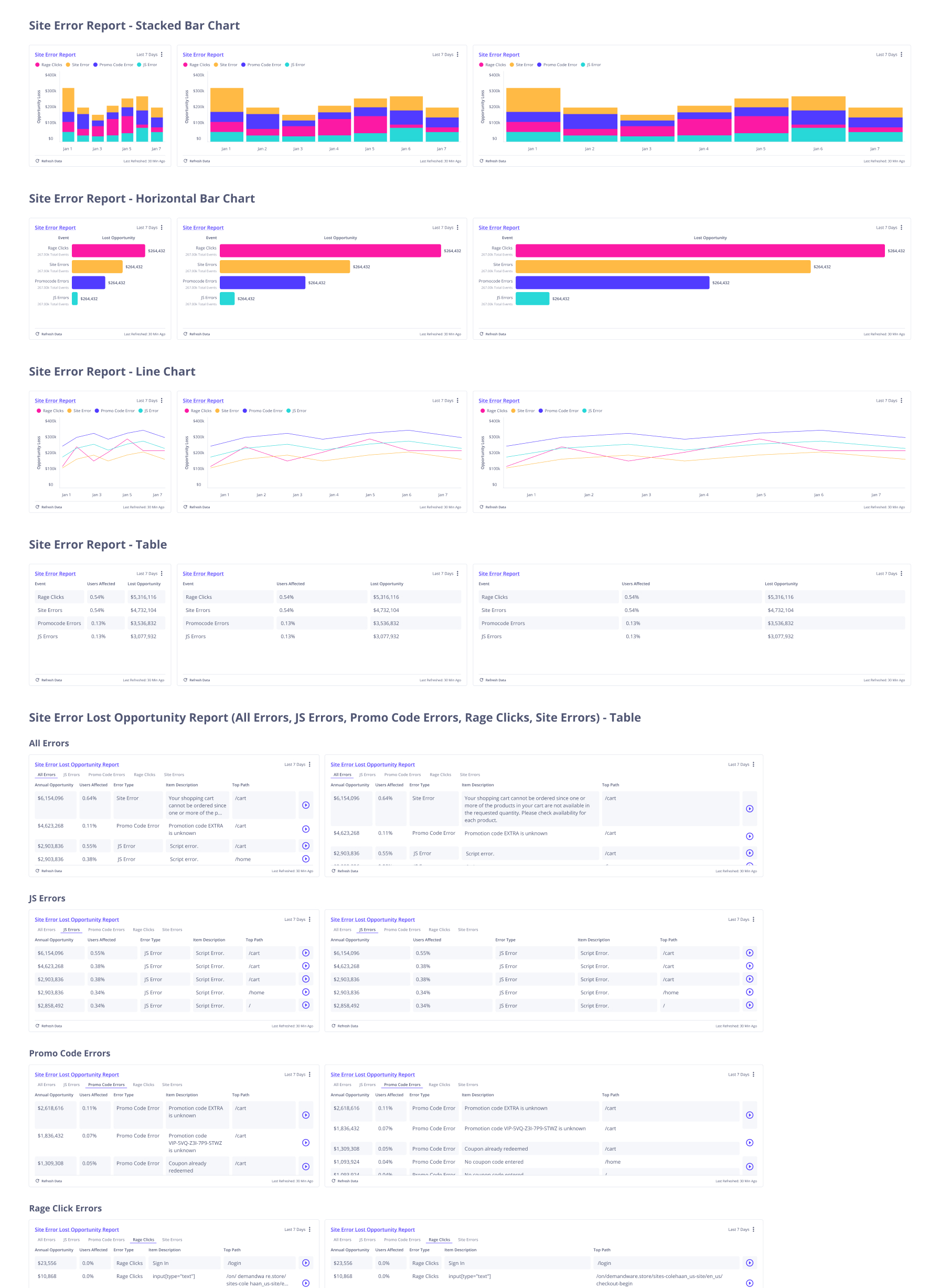
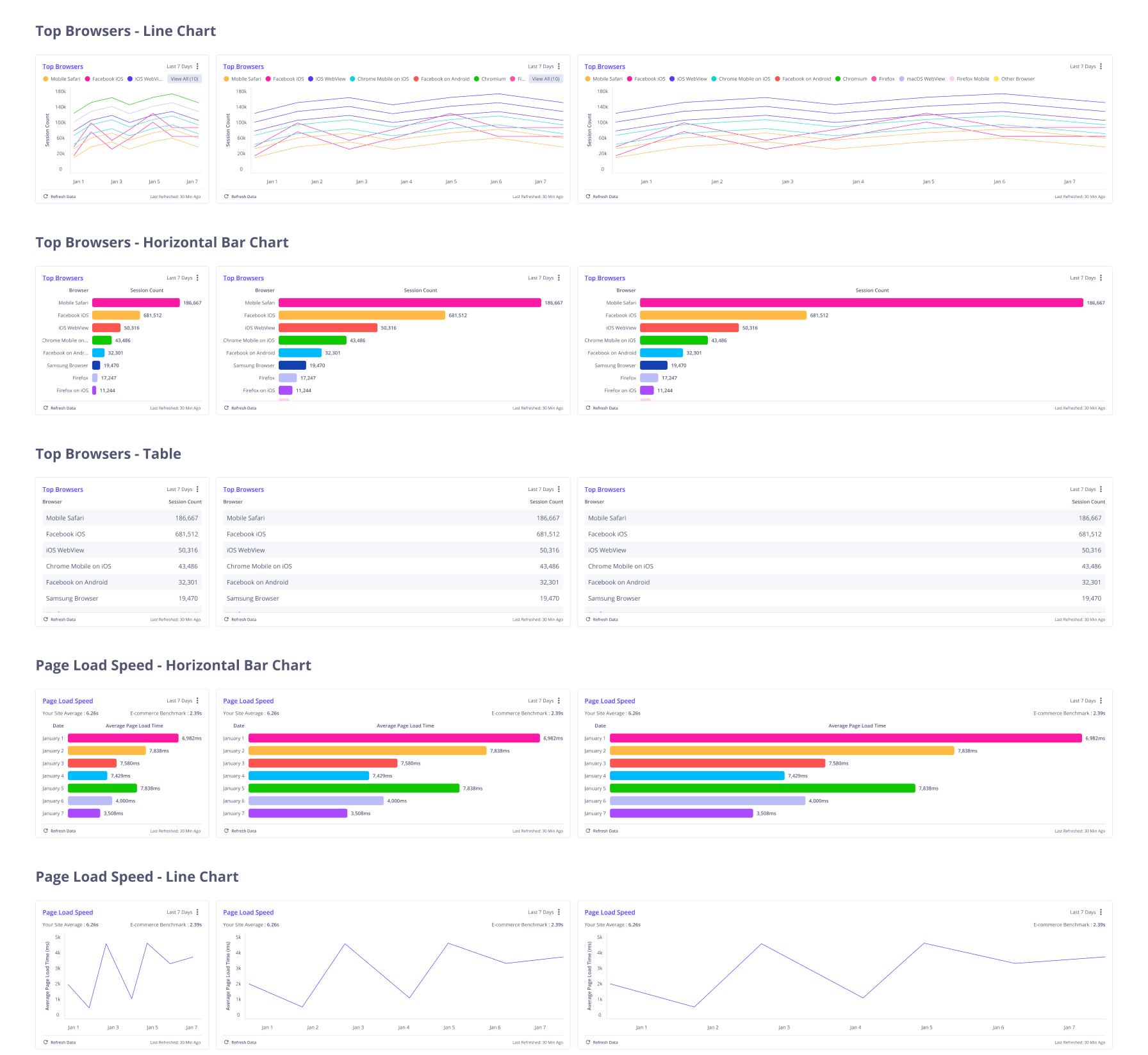
Chart Audit
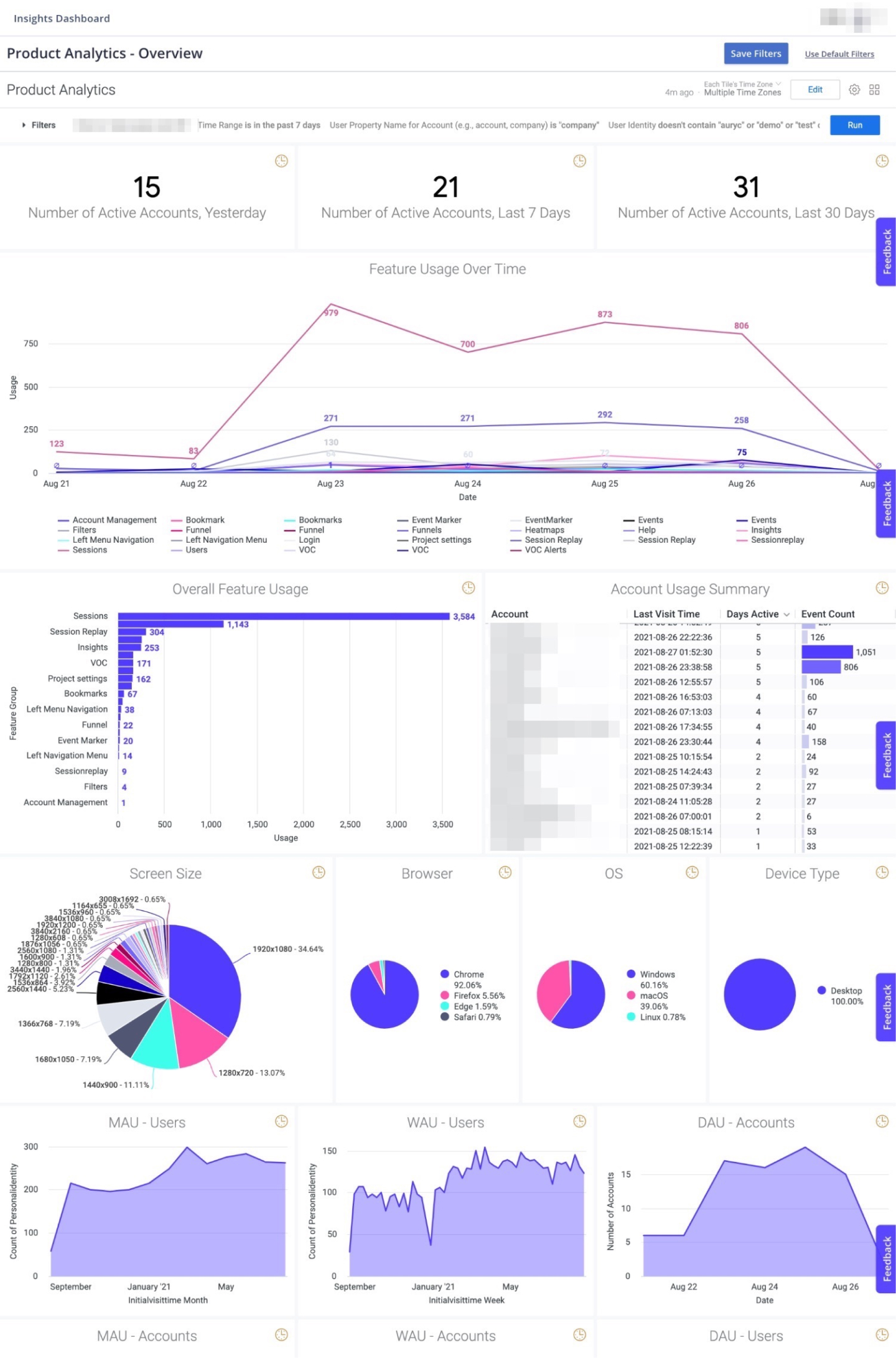
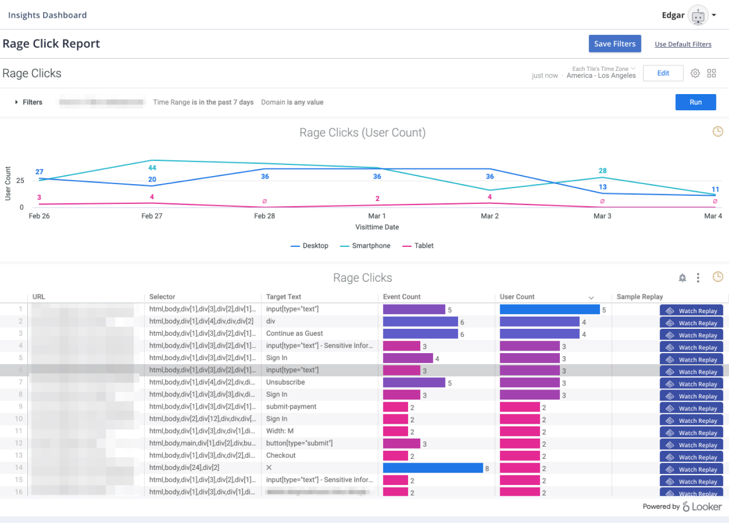
In order to enhance report legibility and give customers the the ability to establish hierarchy within their dashboards we wanted to implement the ability to expand reports across the entire grid row. In order to ensure this would be supported by all reports, I performed an audit of the types of charts we offered through out the entire platform then rebuilt them to work in 3 different sizes.
Editing Dashboards
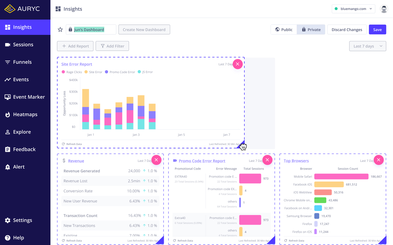
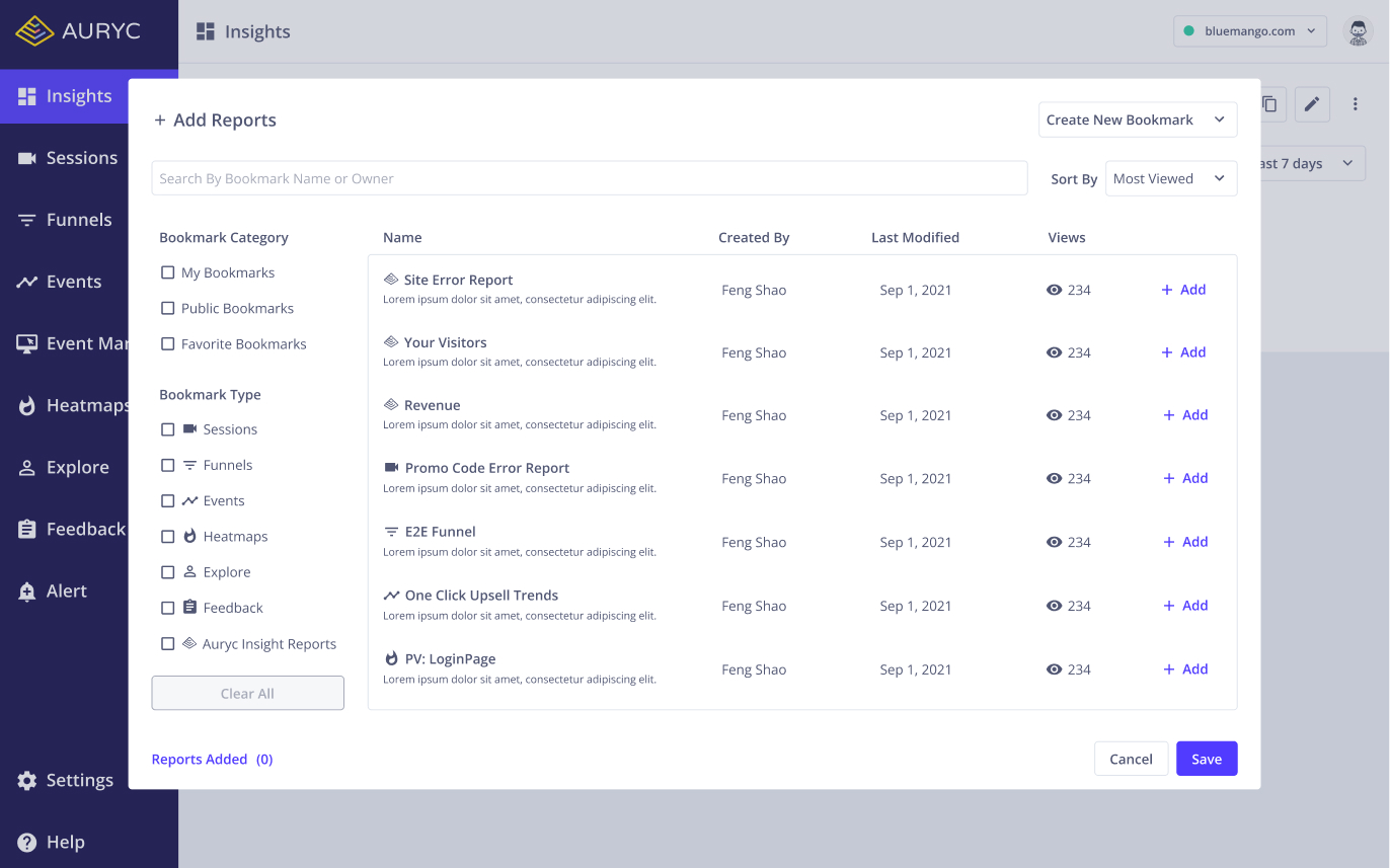
Adding Reports
Dashboard w/ Filter
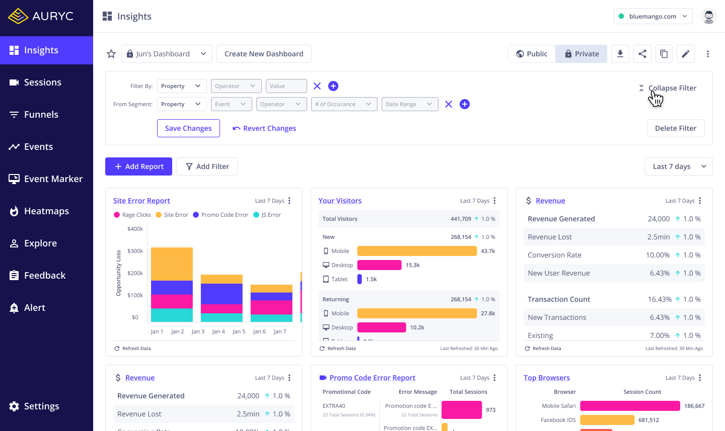
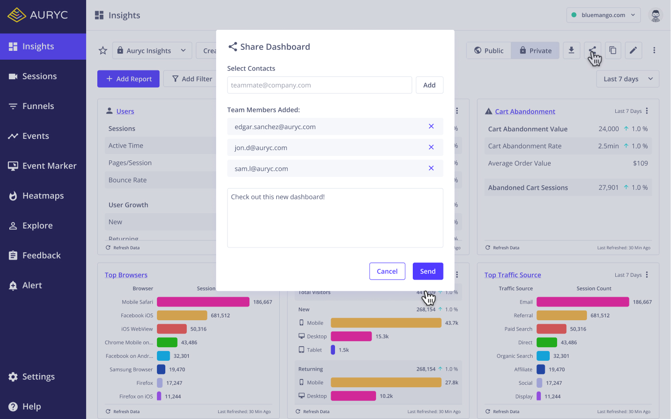
Sharing Dashboards